Alignment
Alignment, also referred to as justification, is the setting of text flow. As we have already covered, reading is a skill we gain; it is unnatural. Automatic eye movement is one skill we are masters at. As our eyes move from line to line they automatically go back to the same horizontal position we started at. Alignment ensures we send our readers to the right position.
The #1 Rule
Always have a specific purpose for changing alignment. Using a variety of alignments can create rhythm and motion while simultaneously cluttering up the page and annoying your readers.
Flush-Right and Centered Alignment
Flush-Right
Lorem ipsum dolor sit amet, consectetur adipiscing elit. Mauris malesuada consectetur magna, et gravida lacus lobortis ac. Fusce ac felis sed lectus faucibus tincidunt. Cras elementum, massa vel dignissim interdum, nisl nisi bibendum lorem, vel fringilla erat erat vitae justo.
Center
Lorem ipsum dolor sit amet, consectetur adipiscing elit. Mauris malesuada consectetur magna, et gravida lacus lobortis ac. Fusce ac felis sed lectus faucibus tincidunt. Cras elementum, massa vel dignissim interdum, nisl nisi bibendum lorem, vel fringilla erat erat vitae justo.
When running text is centered, flush-right or aligned in opposition of a particular script, we send our readers eyes to the wrong place. We read from LTR (left-to-right) and anchor our eye on the left margin. In centered or flush-right text, the left margin is ragged or uneven, making finding the next line much harder. Rather than being an automatic act, readers have to consciously search and adjust their eyes to the start of each line. In return, reading becomes slower and more difficult.
What you need to know.
- Centered and flush-right text blocks are difficult to read.
- Never center or right align bulleted or numbered lists.
- Never center whole paragraphs. Just don't do it.
- Centered text blocks increase the search time because both edges of the paragraph are ragged.
- Centered text is difficult to align with other page elements.
- You can center short phrases, titles or headers, signage, invitations, poems, and song lyrics.
- In other languages such as Arabic and Hebrew, text is read RTL (right-to-left) and therefore, text is aligned flush-right.
Flush Left Alignment
Lorem ipsum dolor sit amet, consectetur adipiscing elit. Mauris malesuada consectetur magna, et gravida lacus lobortis ac. Fusce ac felis sed lectus faucibus tincidunt. Cras elementum, massa vel dignissim interdum, nisl nisi bibendum lorem, vel fringilla erat erat vitae justo.
Flush-left is aligned along the left margin or gutter. In English and most European languages where words are read LTR text is aligned flush left. Flush-left text is the most legible option; it follows a LTR eye movement and is predictable. It is the default in print and online — it is easier to set and more natural to read.
What you need to know.
- Softens the overall appearance of the page by adding white space to the right edge.
- Results in the best block texture and color by preserving the original spacing intended by the typeface designer.
- The right margin is ragged, continue reading to learn how to control rags.
Rags
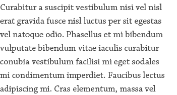
A rag refers to the irregular or uneven vertical margin of a block of type. In flush-left, the right margin is ragged. In flush-right, the left margin is ragged. In center-aligned text, both the left and right margin are ragged.
What you need to know.
- When setting type with a rag, pay attention to the shape of the block.
- A good rag goes in and out from line-to-line in small increments.
- A poor rag creates distracting shapes of whitespace in the margin.
- Left or Right alignment requires less adjustment; the uneven rag reduces the need for perfect alignment.
- Do not rely on the line breaks. Especially online, where you can't control line-length, the <br> tag is not a solution. The only time to use a hard line break is in centered text, just be aware of where you place them.
Widows and Orphans
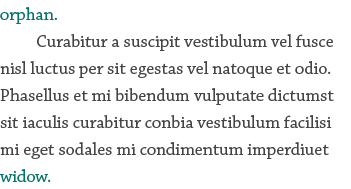
A widow is a very short line – usually one word or the end of a hyphenated word – at the end of a paragraph or column. The short line or word leaves too much white space between paragraphs or at the bottom of a page or column. This interrupts the reader’s eye moving from paragraph to paragraph.

An orphan is a word or part of a word at the beginning of a column or a page. This often happens when text flows in a multiple column layout. It results in poor horizontal alignment at the top of the column or page.
You can fix widows and orphans by reworking the rag or editing the copy.
Justified
Lorem ipsum dolor sit amet, consectetur adipiscing elit. Mauris malesuada consectetur magna, et gravida lacus lobortis ac. Fusce ac felis sed lectus faucibus tincidunt. Cras elementum, massa vel dignissim interdum, nisl nisi bibendum lorem, vel fringilla erat erat vitae justo. Praesent tincidunt rutrum mi, at condimentum sem consectetur vel.
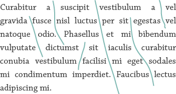
Justified text is flush on both the left and right margin. The even margins give a text block a more formal and geometric appearance. Justified text is the hardest to set; in order for the text to be set flush on both margins requires the adjustment of word-spacing, letter-spacing, and hyphenation on a paragraph level. This tedious process is to combat rivers — the white space created by increasing the spacing between words and letters.


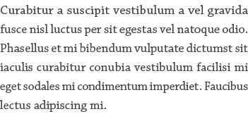
In this example, the block on the left is justified by increasing the space between words. This is the standard way text is justified online and results in rivers — shown by the lines running through the text. The block on the right was manually set by slightly adjusting word-spacing, letter-spacing, and glyph scaling. This is not possible on the Web where you don't have control over line-length, text size, and hyphenation.
What you need to know.
- Justified text typically requires the use of and/or results in more hyphens than flush-left text.
- Do not use justification with short line lengths or narrow columns. Short lines of text will stretch or squeeze a fonts original spacing compromising the readability, color, and texture of the text block. This results in uncontrollable rivers.
- Do not use justification on the Web.
- On the Web justification adds space between words. On-screen you can only add whole pixel increments resulting in large amounts of space between some words (rivers), especially in narrow columns.
- In print we can offset this awkward space by increasing or decreasing tracking, letter-spacing, word-spacing, and glyph scaling in small amounts on a line-by-line basis. This is not possible on the Web where you don't have control over line-length, text size, and hyphenation.
