Tt TotallyType

Anatomy

Typeface anatomy describes the graphic elements and structure of characters in a typeface. Understanding typeface anatomy allows a designer to use type effectively. Anatomy is a key factor in identifying, classifying, selecting, pairing, and setting type.

Getting in Line

A typeface is a delicate system of carefully balanced and stylistically related characters. When characters get in line they should do so in harmony creating rhythm and consistency. This is achieved by aligning each character on five horizontal lines. These horizontal lines are the guides for capital and lowercase letters and ascenders and descenders in a typeface. Each typeface places these lines at different locations relative to the baseline where characters sit. The location of these lines has a large effect on a type design and knowing how to identity where they are allows us to classify, select, pair, and align type and predict how a typeface will perform in the environment we are setting type in.

1. Ascender Height

The ascender height, also called the topline, is where the top of letters or ascenders such as in the letters l and h reach above the cap-height.

2 .Cap Height

The cap-height marks the height of capital letters; it is the distance from the baseline to the top of capital letters such as the E.

3. x-height

The x-height marks the distance between the baseline and the top of lower case letters; specifically, the height of the lowercase x. The x-height is a factor in typeface identification, legibility, and readability.

4. Baseline

The baseline is the imaginary line upon which every character sits. It is a constant, the starting point used for comparing, measuring, and aligning text. In most typefaces round letters such as a or o overshoot the baseline.

5. Descender Depth

Descender depth is how far descenders, such as in the letters p and y, hang or descend below the baseline.

Letters

Typically, anatomy is taught referencing a serif typeface, however, both san-serif and serif typefaces share a global anatomy or skeleton. The structure of letters are used to classify and compare different typefaces. By learning what every typeface has in common it is easier to spot the differences that make classification and identification possible. Anatomy can be grouped into sections: letters, strokes, counter-space, terminals, and serifs. A letter is a character that represents the sounds used in speech; a predetermined symbol of an alphabet, therefore, letters must follow a familiar skeleton.
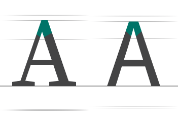
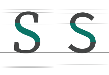
Uppercase

A letter or group of letters of the size and form generally used to begin sentences and proper nouns. Also known as “capital letters”.
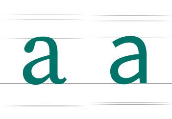
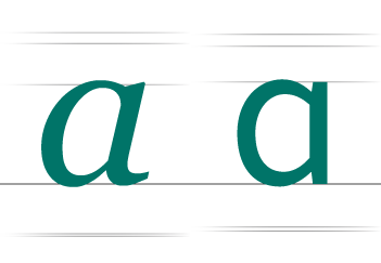
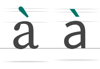
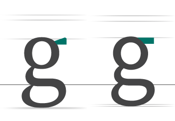
Lowercase

The smaller form of letters in a typeface. They make up the bulk of written text.
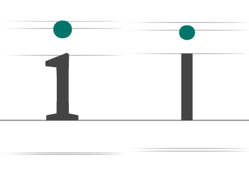
Ascender

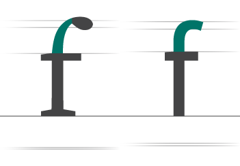
The part of lowercase letters that extend above the x-height.
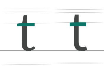
Descender

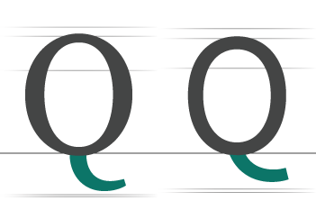
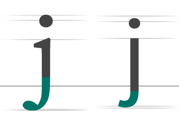
The part of lowercase letters that extends below the baseline.

Double-storey

The double-storey a and g are common in upright roman typefaces. The double-storey a is comprised of a closed bowl and a stem with a finial arm over the bowl creating a partially enclosed area or aperture above the bowl.

Single-storey

The single-storey a and g is most common in handwriting, calligraphy, roman italics, and some sans-serif typefaces. We learn to write the single-story a and g as children. The single-story a (bowl without finial arm) is an identifying feature of a true roman italic. An italicized double-storey a is usually a fake italic.

Serif

A slight projection finishing off a stroke of a letter in certain typefaces.

Axis

An imaginary line drawn from top to bottom of a glyph bisecting the upper and lower strokes is the axis.

Tittle or Dot

A small distinguishing mark, such as an diacritic on a lowercase i or j.

Diacritic

A ancillary mark or sign added to a letter.

Letter Groups

We already defined a typeface as a group of stylistically related characters, but we can take that further by saying it is a group of groups of stylistically related characters. The letters in a typeface can be grouped by relationships or similarites in form, space, and size.

Capitals   Lowercase  
Round OQCGS Round ceo
Round-Square BPRDJU Round-Square bdgpq
Square EFLHIT Round-Diagonal as
Diagonal MNKZY Vertical il
Diagonal-Square VAWX Hooked fjt
Double-storey FHBPSKXY Branched hmnru
Open Sided LTXKZJ Diagonal vwxy
Wide MW Diagonal-Square kz
Narrow IJ Ascending bdfhklt
    Descending gjpqy

Stem and Strokes

A character is a lot like a plant — a stem with branches (strokes) and leaves (parts) attached. Each character in a typeface stems from here — pun intended.

Stem

The stem is the main, usually vertical stroke of a letterform. The stem is the dominant stroke(s) in a character; the stem provides stability to the character making it appear as if it is standing and wont fall over.

Stroke

A stroke is the main diagonal line in letters such as: N, M, z, W, Y, etc. The stroke is secondary to the main stem(s).

Hairline Stroke

A hairline is the thinnest stroke found in specific typefaces that consists of strokes of varying widths.

Bowl

The fully closed, rounded part of a character that encloses the circular or curved parts (counter) of some letters such as d, b, o, D, and B.

Cross Stroke

A horizontal stroke across the stem of a lowercase t or f. The cross stroke differs from a crossbar because it crosses over the stem. The varying positioning, thickness, and slope of the cross stroke is an identifying feature of many type designs.

Crossbar

The Crossbar, also known as a Bar, is the horizontal stroke across the middle of the uppercase A, B and H and the bottom of the eye of an e.

Arm

The arm of a letter is the horizontal stroke on some characters that does not connect to a stroke or stem at one or both ends. The top of the capital T and the horizontal strokes of the F and E are examples of arms.

Leg

The down sloping stroke of the K, k, and R.

Apex

A point at the top of a character where two strokes meet.

Vertex

The outside point at the bottom or top of a character where two strokes meet.

Arch

An arcing stroke is called a shoulder or sometimes just an arch, as in h n m.

Shoulder

The curved stroke that connects the stem and leg in characters such as n and m.

Spine

The spine is the main left to right curving stroke in S and s. The spine may be almost vertical or mostly horizontal, depending on the typeface.

Tail

A tail is a downward finishing stroke typically found in the Q. Some uppercase characters like K and R have tails too.

Hook

The curved stroke in a terminal found in the f and r.

Arc of Stem

An Arc of Stem is a curved stroke the flows into a straight stroke. Examples include f, j and t.

Crotch

An acute, inside angle where two strokes meet.

Finial

A tapered or curved end.

Ear

A small stroke extending from the upper-right side of the bowl of lowercase g; also appears in the angled or curved lowercase r.

Counter-space

Counter-space is the hole in characters, an entirely or partially enclosed space.

Counter

A Counter is the negative or counter-space of a letterform.

Aperture

An aperture is the opening between an open counter and the outside (ocean) of the letter.

Open and Closed Counters

A counter can be described as either being closed or open. If you think of a letter form as dry land, an open counter is a bay and a closed counter is a lake. The bounding-box is the ocean.

Eye

The eye refers specifically to the closed counter in a lowercase e.

Terminals

A terminal is the end of a stroke that does not end in a serif. Coming soon!

Serifs

A serif is a decorative line attached to the end of a stem or stroke in serif typefaces. Coming soon!

Back to Lessons Punctuation