Selecting a text font
Selecting the right text face for the job is no easy task. The following interactive app allows you to compare any two text faces on your system that you may be considering for print or screen use. We will look at body size, x-height, line and letter spacing, typographic color, and contrast - factors that allow a well designed text font to perform the task it was designed for. Once we have a selection we will then pair it with a complementary display face for headings, define a modular scale, and generate a type specimen.
Body size comparison
Select two typefaces to compare.
hamburgevons
HAMBURGEVONS
hamburgevons
HAMBURGEVONS
x-height comparison
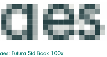
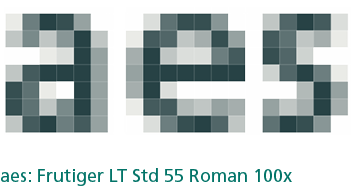
aesxxaes
In a badly designed book, the letters mill and stand like starving horses in a field. In a book designed by rote, they sit like stale bread and mutton on the page. In a well-made book, where designer, compositor, and printer have all done their jobs, no matter how many thousands of lines and pages, the letters are alive. They dance in their seats. Sometimes they rise and dance in the margins and aisles.
In a badly designed book, the letters mill and stand like starving horses in a field. In a book designed by rote, they sit like stale bread and mutton on the page. In a well-made book, where designer, compositor and printer have all done their jobs, no matter how many thousands of lines and pages, the letters are alive. They dance in their seats. Sometimes they rise and dance in the margins and aisles.
Legibility Test
!Iil1
Hamburgevons Hamburgevons
ages ages
fg
gf
bdpqo hnmu
38 56 0O
ae
!Iil1
Hamburgevons Hamburgevons
ages ages
fg
gf
bdpqo hnmu
38 56 0O
ae
Space & Color Test
Problematic: vertrag crainte screw verwalter croyant science verzicht fratricide sketchy vorrede frivolité story yankee instruction take zwetschge lyre treaty zypresse navette tricycle fraktur nocturne typograph kraft pervertir vanity raffeln presto victory reaktion prévoyant vivacity rekord priorité wayward revolte proscrire efficiency tritt raviver without trotzkopf tactilité through tyrann arrêt known
Not Problematic: bibel malhabile modo biegen peuple punibile blind qualifier quindi damals quelle dinamica china quelque analiso schaden salomon macchina schein sellier secondo lager sommier singolo legion unique possibile mime unanime unico mohn usuel legge nagel abonner unione puder agir punizione quälen aiglon dunque huldigen allégir quando geduld alliance uomini
Contrast & Context Test
Contrast Ratio: 1.18:1
Large Text: AA: Fail AAA: Fail
Normal Text: AA: Fail AAA: Fail
Accessible design is good design.
Accessible design is good design.
Please select your text font.
See it in action!
CHAPTER ONE
Loomings.
Call me Ishmael. Some years ago—never mind how long precisely—having little or no money in my purse, and nothing particular to interest me on shore, I thought I would sail about a little and see the watery part of the world. It is a way I have of driving off the spleen and regulating the circulation. Whenever I find myself growing grim about the mouth; whenever it is a damp, drizzly November in my soul; whenever I find myself involuntarily pausing before coffin warehouses, and bringing up the rear of every funeral I meet; and especially whenever my hypos get such an upper hand of me, that it requires a strong moral principle to prevent me from deliberately stepping into the street, and methodically knocking people's hats off—then, I account it high time to get to sea as soon as I can. This is my substitute for pistol and ball. With a philosophical flourish Cato throws himself upon his sword; I quietly take to the ship. There is nothing surprising in this. If they but knew it, almost all men in their degree, some time or other, cherish very nearly the same feelings towards the ocean with me.
Heading
Font:
Text
Font:
Font Size:
Line Spacing:
Letter Spacing:
Page
Foreground:Background:
What's Next?
Now that you have a text face and display face to work with, the next set is to establish hierarchy. Many people set type sizes with a scale. You can use a scale to measure or set the size of any element or negative space in a composition — including grids, and the overall dimensions of the composition itself. Your body text type size of is a good place to start. This sites scale is based on the golden mean (1:1.618). Use the following link to run your font size through Tim Brown's Modular Scale Calculator.
Get Your Scale