Text Size & Measure
In print, the optimal size for body text is 10–12 points. On the Web, the optimal size is 14–24 pixels. To begin to explore these font size ranges, let's look at the most common, 12 points. Most word processing software has a default text size of 12 points. This is not because it is the ideal text size — it is left over from the days of typewriters, actual word processors and low-resolution printers. The ideal text size depends on proximity, how close a reader is to the type. Most print applications — magazines ,newspapers, books, documents, etc. — are read in close proximity. This, along with cost efficiency, is why almost every book is set smaller than 12 point. The further away text is, the smaller it becomes visually. So, as text moves further away we must set our type larger to compensate for the increased reading distance.
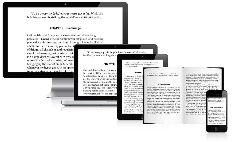
Screens, especially desktop screens, are typically viewed much further away than say a book. Therefore, type set for screen display typically requires a larger font size than type set for print. The default browser font size is 16px (12pt); some may find it too big, others too small; the right font size is different for every user or reader. Additionally, for accessibility reasons, browsers allow users to enlarge or shrink type at will. For example, users with low vision might set their browser preferences to a larger font size. In many ways, an absolute font size is not relevant on screen; what is relevant are relative units that allow our type to scale to any size. By using relative units with a body size set to 1em (16px/12pt), the type will scale to accommodate the user's preferences and needs. This means the text should be readable and legible at a range of sizes. It is also important to consider that two typefaces, even when set at the same point size, do not necessarily have the same optical size. So you can never rely on any absolute unit - only your eye.
Measure
Measure is a key aspect in establishing horizontal motion. We read in groups of 3–4 words at a time. The average line length is around 2–4 word groups per line. In other words, the ideal measure is 6–16 words. It is difficult for your eye to keep track of where it is and where the next group will be when there are too many words in a line. Longer lines of text also require the reader to move their eye further and their heads more often causing eye fatigue. Studies have also shown that long lines are much more likely to cause doubling - accidentally reading the same line twice. On the other side, if a line is too short it can break up words and phrases that were meant be read as a unit.
Words are obviously a bad way to measure; they come in all shapes and sizes. The reason 6–16 words is relevant is because characters are also not the best way to measure. The rule of thumb is 45-75 characters per line, but this can vary depending on your typeface choice. So the key to a good measure is finding the balance between characters and words. For example, a text with mostly short words will typically need a different measure than a text with mostly long words. Measure, margins, and columns go hand and hand. A wider margin results in a narrower column of text.
The same goes for multiple versus single column layouts. The perfect measure is 65 characters (including spaces and punctuation). This magic number is where our 45-75 characters per line rule comes from. The 45-75 rule is a global rule, a starting point that should be applied to all blocks of text. However, in recent years due to the increase in screen resolutions and sizes, this number has increased to 85.