Relative Units
The opposite of absolute units, relative units have no fixed value — they are relative to an absolute unit.
The EM and EM Square
Type is measured in ems. In metal type, the em square is the same dimensions as the type size. It gets its name because early fonts usually cast the letter M on a square body. In digital type, an em is a unit of measurement relative to the point size. The em is not defined by the typeface but by the size we set our type at — in 10 point type, an em is 10 points... and in 36 point type an em is 36 points. An em may or may not equate to the width of the M.
In digital fonts, every character in a typeface is relative to the font size. This allows, like HTML and CSS, the separation of structure (glyphs) and style (size, side bearings, kerning, etc.). By using relative units, a digital typeface can be scaled to any size. Most digital fonts are based on 1,000, 1,024 or 2,048 UPM — units-per-em. The UPM defines a grid for each contour point to snap to. A font with 1000 UPM is designed within a 1,000 x 1,000 unit square (one million units).
The computer system only needs to know the point size, from which it calculates everything relative to. A fonts built in kerning table for example is relative. This allows one kerning table per font rather than one for every point size. Additionally, our hard work can be scaled; when coming from 12 point to 14 point the type size, white space, and our typesetting all get resized proportionally.
Whats the point?
For many years I have seen designers perplexed by font size; saying there is no point to point size when 12 point type doesn't equal 12 points. Point size is not pointless, the bounding box of 12 point type is exactly 12 points tall. However, there are characters and elements in a typeface that reach outside the bounding box. If you want to know more about how font size is calculated in digital fonts, read the following explanation.
What is the deal with point size in digital type.
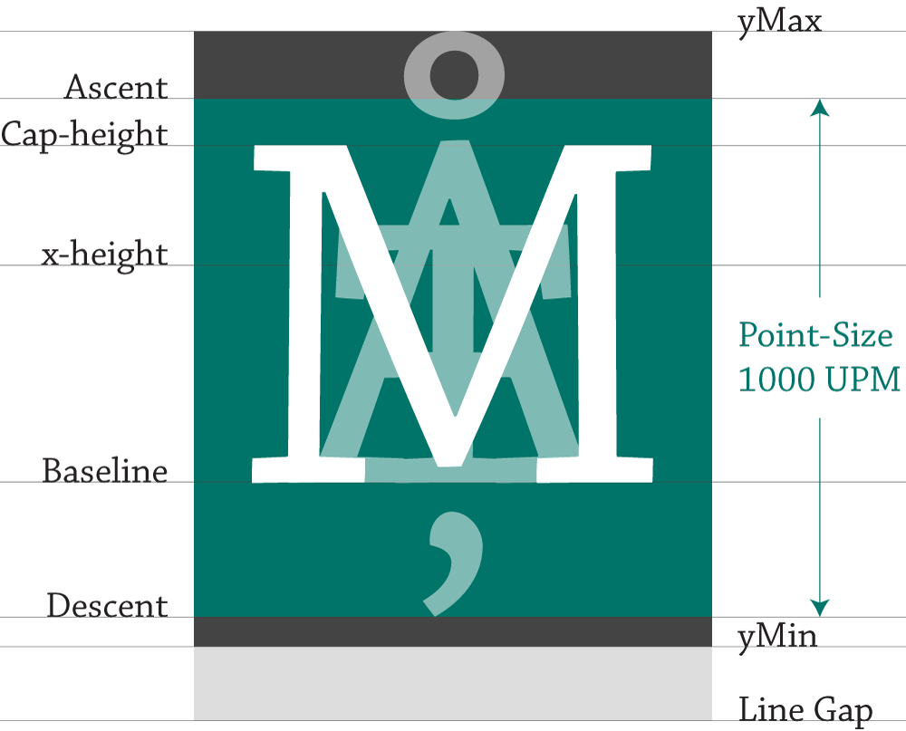
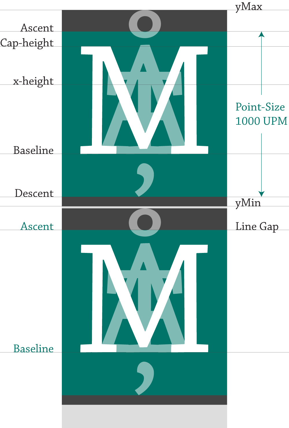
Lets look at Chaparral Pro, the OpenType font used on this site. Chaparral has 1000 UPM. The point-size is the distance between the ascender and descender lines, the 1000 UPM grid scaled. The glyphs within this space get resized proportionally when we set a point size. In this example, we are looking at Chaparral's capital M, tallest ascender Å, and longest descender Ț. Above the UPM is the yMax, Chaparral's max ascender height and below, is the yMin, Chaparral's max descender value. Both the yMin and and yMax values are used to determine the rendered font size and line spacing values. The line gap is used to determine the default line spacing value and overlaps the yMin. In Chaparral, the line gap is 200 and with a UPM of 1000, a font size of 1em has a default line-height of 1.2em.
Lets see how they stack up. The line gap of the top line aligns with the ascender line of the following line of text, this space is 200 UPM. In other words the distance between baselines is 1200 UPM. If we were to decrease or increase the line-height, we are changing this space. Both the yMin of line one and the yMax of line two fit within the line gap with a little room to spare. All of this ensures that ascenders and descenders in lines of type never collide.
What about the Web?
One of the most confusing and complicated attributes in CSS is font-size. In CSS, we have four different units — pt, px, em and % — we can use to set the size of text in a web browser. We already covered the point, pixel, and em.
Percent
Percent is used in web design and works much like the em. The difference is that it is relative to the root font size of a device. For example a desktop browser has a root font size of 16 pixels. If we set our font size to 100%, it is the same as setting it to 16 pixels. The advantage of using the percent unit is that the text remains scalable for mobile devices and accessibility.
Root Font Size
It’s easy to understand the difference between absolute and relative units when you see them in action.
| Base |
body {font-size:100%;} |
body {font-size:120%;} |
| 12pt |
The quick brown fox jumps |
The quick brown fox jumps |
| 16px |
The quick brown fox jumps |
The quick brown fox jumps |
| 1em |
The quick brown fox jumps |
The quick brown fox jumps |
| 100% |
The quick brown fox jumps |
The quick brown fox jumps |
Generally, 1em = 12pt = 16px = 100%. If you increase the base font-size to 120% in the interactive table above, you will see how both relative units — the em and percent units — get larger as the base font-size increases, but the fixed units, pixels and points, do not. For this reason, the em and percent units are preferred on the Web.
REM
The web is not a fixed place so using relative units like ems and percentages are a must. The em and percent are however, relative to the font size of the parent element. In a structure like HTML where we nest our type this inheritance can be a problem. Luckily, there is another relative unit that addresses this problem, the rem or root-em. A rem is not relative to its parent but the root of the document, consider the following example:
/* BASE SIZE = 14px */
body, html {font-size: 14px}

/* --------------- EM --------------- */
/* h1 font-size: 14x2.5=35 | margin: 35x0.6=21 */
#em h1 {font-size: 2.5em; margin:0.6em 0;}
/* h2 font-size: 14x2=28 | margin: 28x0.75=21 */
#em h2 {font-size: 2em; margin:0.75em 0;}

/* --------------- REM --------------- */
/* h1 font-size: 14x2.5=30 | margin: 14x1.5=21 */
#rem h1 {font-size: 2.5em; margin:1.5rem 0;}
/* h2 font-size: 14x2=28 | margin: 14x1.5=21 */
#rem h2 {font-size: 2em; margin:1.5rem 0;}
See the Pen EM vs. REM by Rhett (@rhettajf) on CodePen.
In the example above, because the em is relative to the parent, each margin must be calculated individually. When we use the rem to set our margin, it is relative to the root or document font size, not the parent. If you’re trying to set consistent padding or margins to establish a rhythm, the rem can be very helpful.