Tt TotallyType

History of Type

We learn the canon of typography through a historical context. An understanding of history is essential for understanding typography contextually. To understand, use, or learn typography, you must first understand the origin, purpose, and why the canon of typography was developed in the first place. This understanding allows us to expand upon what we know, avoid the same mistakes, and transition into new technologies. As Richard Hollis wrote: “Eyes and brains have worked the same way over generations…the environment changes but the principles of visual communication survive. History helps us understand these principles.”. Understanding the context of typographic principles allow us to see similar contexts today and rather than reinvent the wheel, extend and adapt collective knowledge.

Any significant shift in typography runs parallel to new reading environments, technologies, or social change; printing and paper-making, for example, developed simultaneously. As humans and technology advance, new ways of communication emerge, and the message and means of production change. Every change in production guided the development of new approaches to visual communication. Looking back on typography's long history, it is abundantly clear that practice responds to new technologies.


Pre-Venetian

ABCDEFGHIJKLMNOPQRSTUVWXYZ
abcdefghijklmnopqrstuvwxyz

Pre-Venetian, also called Ancient, typefaces are inspired by historical forms from before the 15th century. Many include the Incised (Antique) and Fraktur (Blackletter) styles. Pre-Venetian typefaces were modeled after letters carved in stone. Blackletter is a style of calligraphy using vertical, curved, and angled strokes. Pre-Venetian type wasopular from the Middle Ages through the Renaissance.

1440

Johannes Gutenberg invents the printing press using metal movable type and a screw press.

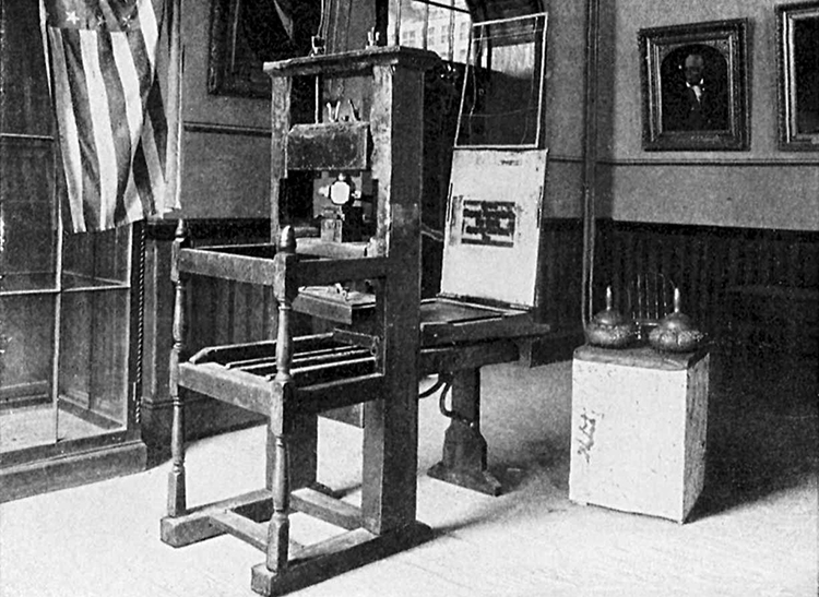
The process used a punch made of steel with a mirrored image of a letter struck into metal and placed into a matrix to form a page that was inked and pressed into paper.

1455

The older medium of the scribes was reflected in the first Blackletter prints.

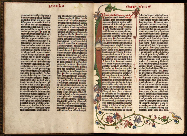
The letterforms in Gutenberg’s famous 42-Line Bible were based on liturgical scripts of the era; Textura Quadrata, a form of blackletter.


Incised (Antique)

Fraktur (Blackletter)

Venetian

ABCDEFGHIJKLMNOPQRSTUVWXYZ
abcdefghijklmnopqrstuvwxyz

Movable type spread across Europe, and in less than fifty years, there were thousands of printers. As more people began to read, words became shapes and the demand for legibility and aesthetic appeal became greater. Movable type opened up opportunities for reproducing texts creating a demand for typefaces.

The hand-inspired Pre-Venetian lettering was difficult to read and time consuming to set; it did not reflect the demands and productivity of Gutenberg's printing press. In response, typesetters began looking for inspiration in various writing forms. Venetian, also called Humanist and Renaissance Antiqua, typefaces were based on pen-formed writing; characterized by a stong oblique axis, low contrast, and abrupt letterforms based of the broad-tip pen.

Woodcut of Mainz from the Nuremberg Chronicle 1493

Italy 1462

Mainz, the German printing capital, is sacked. Printers are forced to fled — most go to Italy where they are exposed to the Renaissance movement that was drawing Europe away from medieval practices.

Rather than using blackletter or Fraktur type, printers began to create type that mimicked the hand of Italian humanist writers.

c.1465

Uneven pressure from the screw press and the coarseness of printing surfaces still required thicker strokes to hold up.

1465

Conrad Sweynheym and Conrad Pannartz set up the first press in Italy at the Benedictine Monastery of Subiaco.

Nicolas Jenson 1470

Inspired by text on ancient Roman buildings, Nicolas Jenson combined a Gothic calligraphy with Italian humanist handwriting, creating the first Roman Type. Jenson's Roman type was very legible and have an even color; it was much more readable than blackletter, and caught on quickly.

Jenson's Roman typeface cut in 1470.

Capitals of Jenson's roman typeface, from a translation 'in fiorentina' of Pliny the Elder, published in Venice in 1476.

1489

More than 50 printers are established in Venice, a wealthy sea trading community. Located close to four major universities, Venice became the printing capital of the Renaissance.

c.1500 Aldus Manutius

As print spread so did the demand for books. Early books were very large. To meet the need of scholars and students, Aldus Manutius wanted to produce books that could be transported. He invented the 'pocket edition' called an octavos that could be carried and read anywhere. Pocket books were the first version of the modern paperback and some even featured only text.

1501 Italics

To fit more words on a page, Aldus Manutius commissioned Griffo to cut a condensed typeface. Griffo based it upon chancery manuscript, a contemporary cursive Roman face. It became known as Aldinian. Today, we call it italics and use it for emphasis.


e

Sloping cross-bar on the lowercase e.

O

an acute `angle of stress'

V

Low contrast between thick and thin strokes.

.

The square full point.

x

Small x-height.


Suspendisse bibendum sit amet est et eleifend. Suspendisse imperdiet, diam quis sollicitudin ultricies, orci metus mollis mauris, id convallis urna magna eget lacus. Ut ut placerat metus. In non neque sodales, pharetra lectus id, fermentum ipsum. Phasellus cursus accumsan pharetra.

Venetian type has a dark block color; combined with a small x-height, low stroke contrast, and an acute ‘angle of stress’, Venetian types do not lend themselves to modern design treatments or the screen.

More coming soon

Check back later for more updates to the timeline. In the meantime, you can preview the classifications below.


Garalde

ABCDEFGHIJKLMNOPQRSTUVWXYZ
abcdefghijklmnopqrstuvwxyz

Garalde or Old Style type shows the steadily improving skills of punchcutters. Garalde type is characterised by a greater contrast between thick and thin strokes, and are generally sharper and more refined. You can see this refinment in the serifs; the serifs on the ascenders are more wedge shaped.


Transitional

ABCDEFGHIJKLMNOPQRSTUVWXYZ
abcdefghijklmnopqrstuvwxyz

The transitional period falls between the Venetian and Didone. Transitional types were influenced by Neoclassicism manifested by a near vertical axis, higher stroke contrast, and sharper serifs.

Didone

ABCDEFGHIJKLMNOPQRSTUVWXYZ
abcdefghijklmnopqrstuvwxyz

Didone overlaps the Transitional period. Didone types reflect the ideals of Romanticism by exaggerating Transitional features. Didone types have a vertical axis, more uniform widths, thin straight serifs, and a sharper stroke contrast.


Slab Serif

ABCDEFGHIJKLMNOPQRSTUVWXYZ
abcdefghijklmnopqrstuvwxyz

Prior to the Industrial Revolution, typefaces were designed almost exclusively for books. With new technologies, printers and advertisers needed bigger and bolder display faces for advertising. Typography responded with forms of Slab Serifs: the unbracketed Egyptian and bracketed Clarendon.


Sans Serif

ABCDEFGHIJKLMNOPQRSTUVWXYZ
abcdefghijklmnopqrstuvwxyz

The sans-serif was already in use by the time the slab-serif was created, therefore, we have to step back in time. The sans-serif emerged in the 18th century and became popular in the early 19th century. Early sans-serifs are known as grotesques, they get there name because readers felt the lack of serifs was an abomination departing from hundreds of years of serif tradition.

Simplicity requires the greatest effort. Without the decorative serif distractions, the proportion, color, and balance needs to be flawless. Besides the lack of serifs, the biggest difference in contrast. Sans serifs are characterized by low contrast. The lack of contrast and simplicity lead many to feel that sans-serif types have less personality than their serif counterparts. This is far from the truth; sans serifs are great for abstraction and creative usage as they are less tied to historical contexts. There are four classifications of sans-serif types: Grotesque, Neo-grotesque, Geometric, and Humanist.

Grotesque

ABCDEFGHIJKLMNOPQRSTUVWXYZ
abcdefghijklmnopqrstuvwxyz

Grotesques were the first widely used sans-serif types; characterized by having almost no stroke contrast, slightly square curves, and a Roman lowercase g. Many Grotesques have a curled leg on the R and a G with a spur. Modern Grotesques have a less pronounced stroke contrast, a monotone weight stress, rounder curves, and a single bowl g.

Neo-grotesque

ABCDEFGHIJKLMNOPQRSTUVWXYZ
abcdefghijklmnopqrstuvwxyz

Neo-Grotesque, also called Transitional or Realist, are more refined Grotesques. Type designers set out to redeem the Grotesque by refining the awkward Grotesque curves. Neo-Grotesques are characterized by the single-story g and less line weight variation.

Humanist

ABCDEFGHIJKLMNOPQRSTUVWXYZ
abcdefghijklmnopqrstuvwxyz

Humanistic sans-serif typefaces are based on the skeleton of Roman inscriptional letters and therefore carry the calligraphic influence, characteristics, and proportions of serif types. Their roots in Roman letters make them the most legible and easily read sans-serif type.

Geometric

ABCDEFGHIJKLMNOPQRSTUVWXYZ
abcdefghijklmnopqrstuvwxyz

Geometric sans-serif types have simple geometric shapes and almost completely monolinear strokes. Geometric type are typically less readable than Grotesques or Humanistic sans-serif types.

Back to Lessons Families