A Family of Fonts

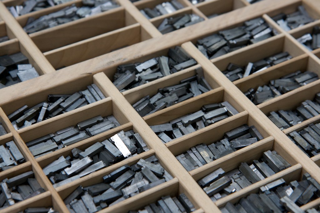
The California Job Case contained a single font: uppercase & lowercase letters and 37 additional characters. by Marcin Wichary

The California Job Case contained a single font: uppercase & lowercase letters and 37 additional characters. by Marcin Wichary
Back in the days of movable type, printers needed thousands of metal blocks, each a single character. If you wanted to set your text in Garamond, you needed different blocks for every character, point size and weight you wanted to use. This is where we get the terms typeface and font. Those thousands of metal blocks of Garamond was a typeface, a single typeface design. You couldn't call every variation, all those different blocks, Garamond so a subset of blocks, a particular size, weight, or style, was called a font. Garamond 10 point was a different font than Garamond 8 point. The two terms became somewhat synonymous with the rise of desktop publishing and digital fonts. Fonts were no longer thousands of blocks — but thousands of bytes that scaled themselves up or down to any size — see units to learn more. A typeface is a family of fonts.
Family
Printers began organizing roman and italic fonts into families as early as the sixteenth century. However, it wasn't until the the beginning of the twentieth century that the family as we know it was formalized. Today, a family include styles such as italic, bold, and small caps.
Roman or regular is the core typeface in a family.
Italic letters, based on cursive writing, are used to create emphasis.
Small caps have a height similar to the x-height or lowercase.
Bold is used for emphasis within a hierarchy.
Bold Italic is also used for emphasis within a hierarchy.
Superfamilies
A traditional roman typeface has a small family — an group consisting of roman, italic, small caps, and sometimes bold and semibold each with italic variants. Some families come in many more weights and sizes, such as thin, light, black, compressed, condensed, caption, and display. A superfamily can consist of dozens of fonts in multiple weights and/or widths, sometimes with both sans-serif and serif versions. Below are some of the fonts in the superfamily Chaparral Pro — the ones used on this site.
Light text in headings can contrast body text.
Light Italic text in headings can contrast body text.
Roman or regular is the core typeface in a family.
Italic letters are used to create emphasis and are based on cursive writing.
Small caps have a height similar to the x-height or lowercase.
Semibold is used for emphasis within a hierarchy.
Semibold Italic is also used for emphasis within a hierarchy.
Bold is used for emphasis within a hierarchy.
Bold Italic is also used for emphasis within a hierarchy.
Display Regular is used for short bursts of copy at large sizes.
Display Regular Italic is used for short bursts of copy at large sizes.
Display Bold is used at large sizes.
Display Bold Italic is used at large sizes.
